this is my final movie. overall, i like the way it turned out. i like the emotion i created with simple grayscale text and the flow of the design overall. i am glad that i made the animations consistent on my final renderings. it really pulled it together. it also helped that i created depth with the repetition of some of the words. so here it is:
final movie from josey kruse on Vimeo.
Monday, March 30, 2009
Thursday, March 26, 2009
Wednesday, March 25, 2009
bruce mau design | denver biennial of the america's art director
what an intriguing video. simple yet effective approach.
design observer
what an interesting site this was. design observer. observing design. i really took a lot from the main article: type means never having to say you're sorry. first and foremost it made me think about how involved you need to be in every step of the project when it comes to designing something, whether it be a poster or a business card, a book or a magazine spread. knowing how and why you got there can be a big help, and is a huge influence on the overall turnout of the piece. i have found myself having a bit of trouble doing this. i find myself having an idea and not getting as involved as i can in the research. i need to learn to "emerge" myself into that initial stage, and it is something i am going to work on. i am motivated. i haven't ever been overly excited about the font futura. i think it is has a good feel for certain things, but overall it's just not my "type"...haha, so to speak. i totally didn't mean that. :) i am personally addicted to univers, is that a bad thing? if there is any font in the approved list that would be a close "replacement" i feel frutiger would probably be one of the best. i think in all of its different forms, bold, regular, italic it matches up the closest, but has a better fit i guess.
http://www.designobserver.com/archives/doentry38869.html
the other article i read was about the top ten things that need to be redesigned. from lottery tickets to the labeling on blister packages (gross i know), there are many things that we as a society has, how do you say?, "conformed to", and just gotten used to it looking like that. an interesting example was political signs and how they are all red, white, and blue with a flag on them that sits at the eye level of a lawn gnome, election in and election out. is there a rule somewhere that says this is how it has to be? regardless, it was a very interesting and entertaining article. check it out for yourself. i love other peoples' opinions.
http://www.designobserver.com/archives/doentry38869.html
Sunday, March 22, 2009
Thursday, March 19, 2009
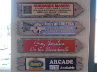
my GLORIOUS walk...in Florida
I thought the article about all of this typography was interesting. For my walk, I happened to be in Florida at the time, and it really made me look at the area in a different way. It was difficult for me to find typography that was engraved into buildings and stuff, because the area I was at was more modern I suppose. I did find some quite interesting neon signs and other fun uses of the materials around. Most of these pictures are from a place in St. Petersburg, FL called John's Pass. It is a fun little shopping area with all kinds of fun, "touristy" things to do. The others are from the Downtown area including clubs, restaurants and other businesses.Take a look and see....come walk with me...?


Monday, March 9, 2009
TED
What an interesting video. I was really engaged in this seminar the entire time. It is so real to think about. If I looked back on my life and thought about the times I was happiest, they would revolve around art and design. Guess that means that I am always going to love what I do. If I had to ask him something it would be how scared he was to pack everything and get a completely new job in a world unknown. I would be scared...sh*tless!
What else caught my eye was that article, and a certain part of it: “There are professions more harmful than industrial design, but only very few of them. And possibly only one profession is phonier: Advertising design. In persuading people to buy things they don’t need, with money they don’t have, in order to impress others that don’t care, it is probably the phoniest field in existence today.” How true is this. How sad is it?..or isn't it? I think it is all part of the vicious cycle of life, and a part of who we are. It is a part of who we are as designers.
What else caught my eye was that article, and a certain part of it: “There are professions more harmful than industrial design, but only very few of them. And possibly only one profession is phonier: Advertising design. In persuading people to buy things they don’t need, with money they don’t have, in order to impress others that don’t care, it is probably the phoniest field in existence today.” How true is this. How sad is it?..or isn't it? I think it is all part of the vicious cycle of life, and a part of who we are. It is a part of who we are as designers.
Tuesday, March 3, 2009
tha posta

this poster really caught my eye for a variety of reasons. the color contrast is great, and i like that halftone effect done on the hands, i think it helps balance out the brightness of the poster. referring to the reading, there are many elements displayed in this poster. although not a common symbol, this is a metasymbol for just what it is saying, access. it is saying that these things are available at your fingertips, and are easy to reach. another element displayed is denotation, which is the direct meaning of a word, sign, or image, much of which i just spoke about concerning metasymbol. Image combination is also expressed in this poster with a photographic hand (even though it was altered with the halftone effect) and then an expressive illustration such as the flowers. I would also say that this poster is a metaphor for something being available at your fingertips as I mentioned before, but that "something" being a lot, more than just one thing, a whole group of things. I feel the full bouquet of flowers is representative of that. This poster is successful overall I feel, but it's possible that the idea of the bouquet could be a bit clearer, but still works.
challenge one is done!
 this is an image of my final graphics poster and the link to my flash design. check it out!
view my flash project at my personal website:
www.people.ku.edu/~jmkruse/index.html
Monday, March 2, 2009
i have a dream too
i have a dream, that one day, i will have no homework...and that will probably never come true :) so in the mean time i'll keep on keepin on


Subscribe to:
Posts (Atom)